Designing a More Professional, User-Centered Experience for GAO Tek Asia
As part of my internship at GAO Tek, I redesigned the GAO Tek Asia website — including the homepage, careers page, and individual job listings. The goal was to create a more structured, modern, and user-friendly experience while aligning with the company’s global brand guidelines. By improving layout clarity, navigation flow, and visual hierarchy, the new design helps users — from clients to job seekers — find what they need with confidence and ease.

Introduction
During my internship at GAO Tek Inc., I was given a meaningful challenge:
Redesign the GAO Tek Asia website — including the homepage, careers page, and individual job listings — to improve clarity, structure, and user engagement.
GAO Tek is a global supplier of fiber optics and test equipment, with clients across North America, Asia, and beyond. While their technology is cutting-edge, their website needed serious improvement in terms of layout, consistency, and user flow.
The Challenge
The existing GAO Tek Asia website felt cluttered, outdated, and lacked hierarchy. Key issues included:
Confusing layout and dense text blocks
No clear visual system or component consistency
Difficult navigation for job seekers and potential clients
Lack of trust-building visual cues (e.g., testimonials, badges, modern structure)
The biggest challenge?
I needed to balance corporate expectations and global branding guidelines — while still making the experience smoother and more user-centered.
Research & Discovery
Before jumping into design, I started with a comparative audit — reviewing both:
The GAOTek.com global site
The current Asia GAO Tek site )
Competitor websites in the B2B electronics space
This helped me understand:
What GAO Tek already had (strong product range, legacy credibility)
What competitors did better (cleaner navigation, clearer CTAs, modern layouts)
What users needed (easier job application flow, scan-friendly content, visual credibility)
I also received a design guideline from the company, which set guardrails on brand color, font, logo, and tone. It took around 2 weeks of back-and-forth before my proposed layout was approved.
My Role & Responsibilities
As a UI/UX Design Intern, I worked on:
Conducting website audits and competitive analysis
Redesigning the homepage, careers page, and job detail pages
Following brand guidelines while introducing structure and visual hierarchy
Presenting my work to supervisors for feedback and approval
Preparing final screens for developer handoff
Design Goals
Create a professional and trustworthy first impression
Simplify the navigation and highlight key product areas
Improve the job application flow to attract more qualified applicants
Make the content feel scannable, modern, and accessible
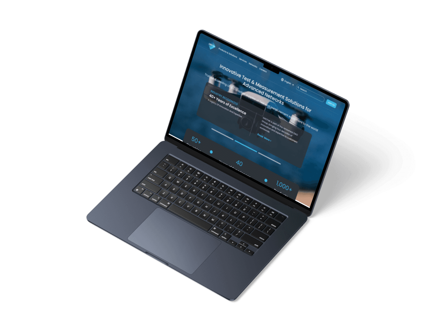
Before: The Original Homepage
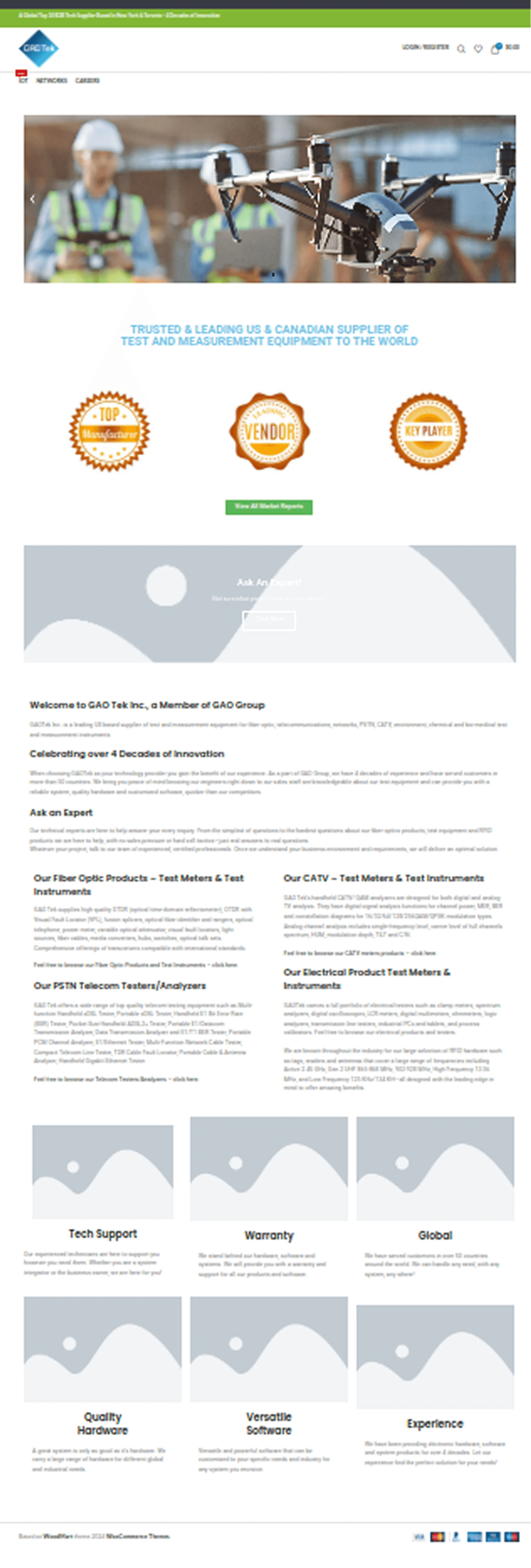
The original homepage was content-heavy, with little visual hierarchy and unclear CTAs. It didn’t reflect the tech-forward, global brand GAO Tek aimed to be.
The Redesign Approach
I introduced a layout that felt structured, professional, and clean — keeping the content intact but improving its presentation.
Key changes included:
Modular sections for company intro, product highlights, and trust signals
Simplified navigation for Careers and Job Listings
Cleaner typography, more whitespace, and visual consistency
CTAs like “Ask an Expert” and “Apply Now” made more prominent
Redesigned Pages
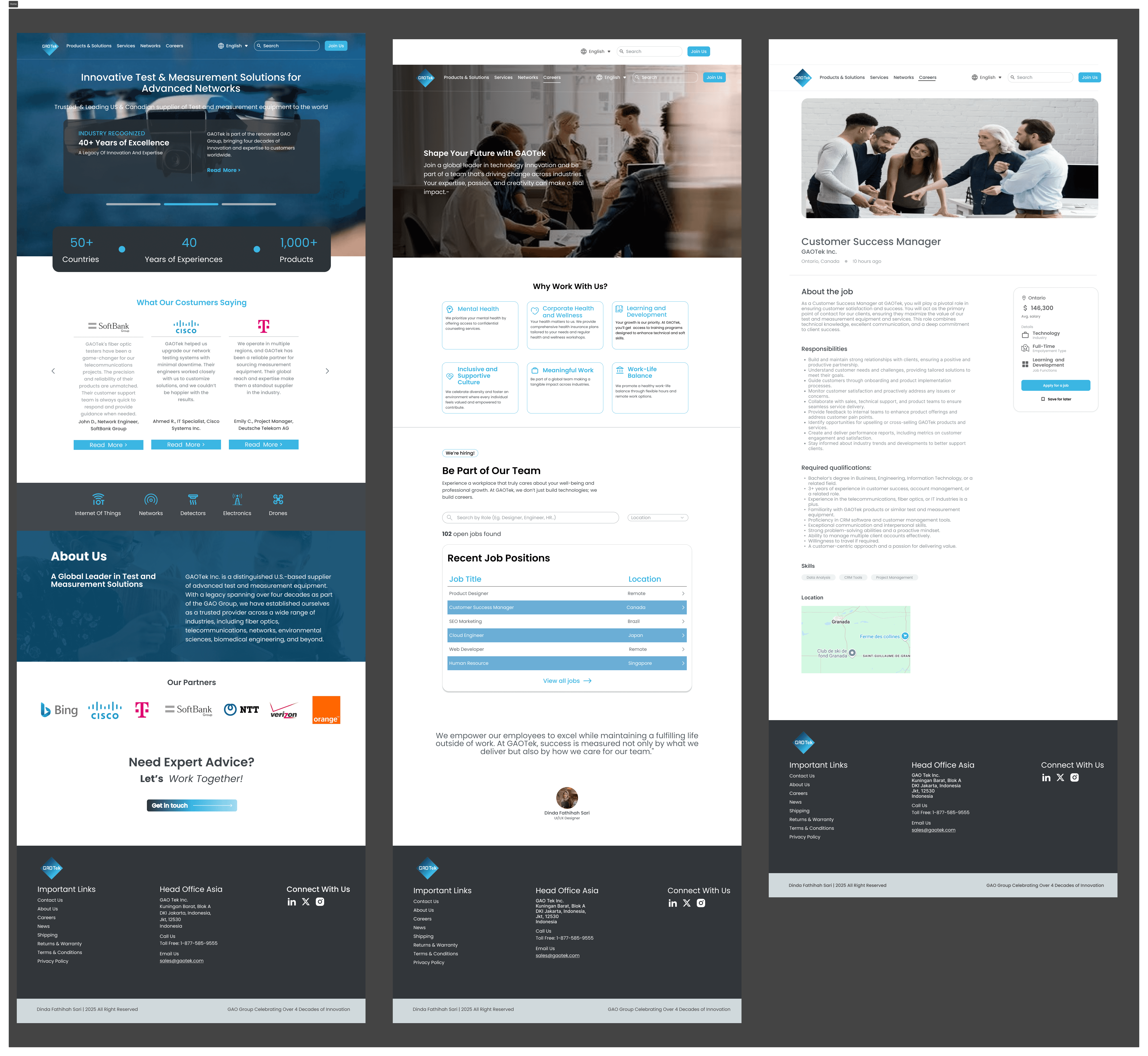
Homepage
Clearer intro to the company
Visual badges and trust markers
Content reorganized into digestible blocks
Careers Page
Friendly, inviting intro
List of job openings in card format
Direct links to detail pages
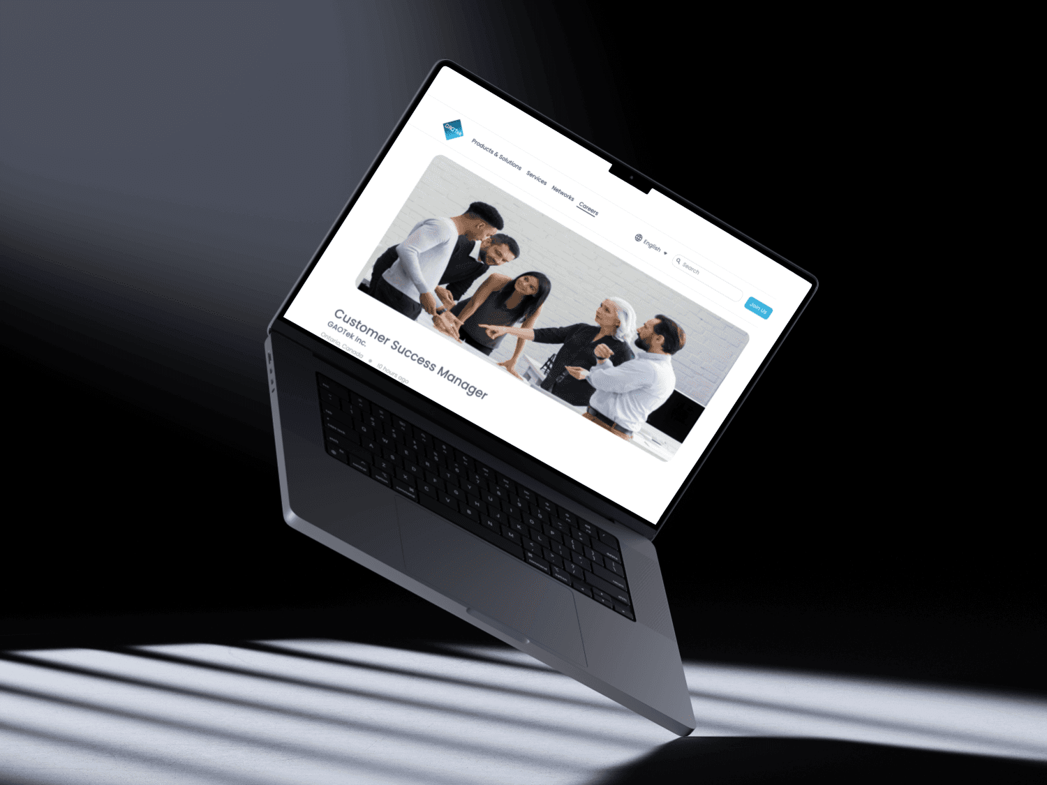
Job Listing Page
Structured layout for job details
Strong CTA to apply
Clean separation of sections (Responsibilities, Requirements, How to Apply)
What I Learned
This project taught me how to:
Balance brand constraints with user needs
Communicate effectively across design approval processes
Keep B2B interfaces professional, yet approachable
Use layout and hierarchy to make long-form content easier to digest
It was my first time designing for a real-world, global-facing company — and it showed me that even small UI changes can greatly improve the user experience.
