Boosting User Satisfaction Through Personalized Streaming Experiences for Disney+ Hotstar
A UI-focused redesign of Disney+ Hotstar aimed at solving key user pain points — from frustrating logins to irrelevant content recommendations. By introducing smoother login options, onboarding personalization, and advanced filters, this revamp helps users feel more in control of their streaming experience — making it faster, smarter, and truly tailored to their taste.

Introduction
As part of a UI/UX Bootcamp final project at MySkill, our team set out to improve the Disney+ Hotstar app — not just visually, but meaningfully.
With low ratings on the Play Store and a growing number of user complaints, it was clear something wasn’t working. From login issues to irrelevant content recommendations, users weren’t just frustrated — they were dropping off.
That became our mission:
How might we enhance the Disney+ Hotstar experience to be more intuitive, personalized, and frustration-free — especially for Gen Z and young adults?
UX Research Summary
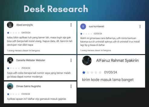
“User interviews and desk research revealed common frustrations, especially around login failures, irrelevant recommendations, and limited filtering.”
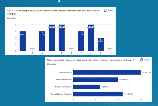
Our researchers dove deep using surveys, interviews, desk research, and competitor analysis. Here’s what they found:
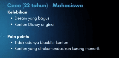
Key Pain Points:
Login issues: OTP errors made access frustrating
Generic recommendations: Users felt suggestions didn’t match their taste
Lack of advanced filtering: Hard to search by genre, year, or rating
No personalization after sign-up
We also compared Disney+ Hotstar to platforms like Netflix and found gaps in login options, filtering tools, and recommendation accuracy.
Design Goals
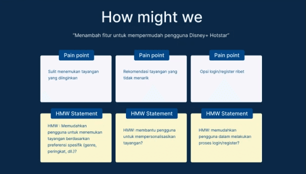
From those insights, our team outlined three core goals:
Simplify the login process by adding more options like Google or email
Enhance personalization by letting users select genre preferences early
Empower smarter search with filters for year, genre, rating, and country
“Our goals were shaped directly from user needs: simplify access, personalize content, and support smarter browsing.”
My Role: UI Designer
As the UI designer on this project, I focused on turning the team’s research-driven ideas into a clean, modern, and responsive interface.
I worked on:
Visual layout and hierarchy
Design system and components
Wireframes and high-fidelity mockups
Interactive prototyping in Figma
Usability testing & iteration
Key Features We Redesigned
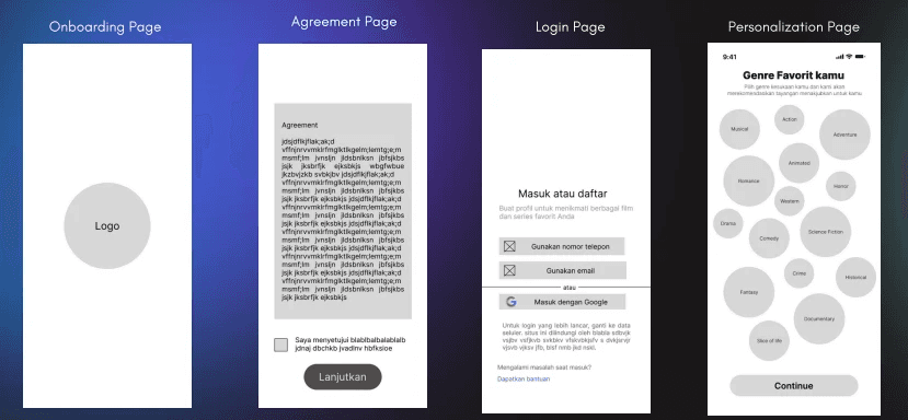
1. Login Flow
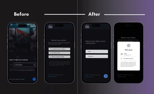
“Revamped login screen with Google and email options — designed for a faster, frustration-free experience.”
Before: OTP-only login that often failed
After: Users can now log in using Google, email, or phone — with a friendlier interface
“Now logging in is smoother, faster, and actually works — feedback from all testers was positive.”
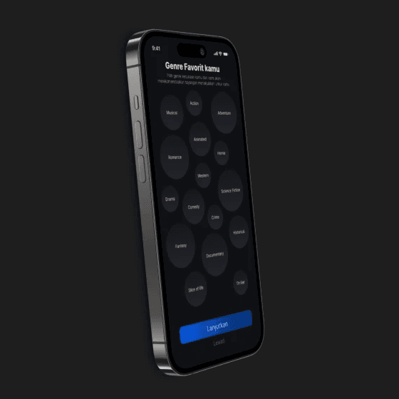
2. Personalization Onboarding
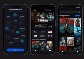
“Users now select favorite genres right after sign-up, improving recommendation accuracy from the start.”
Right after sign-up, users can choose their favorite genres. This powers tailored recommendations that actually match their interests.
“I like how the homepage now feels more like my taste, not just random trending shows.” — User tester
3. Advanced Filter System
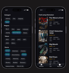
We added a filter tool that lets users search content by:
Genre
Release year
Country
Rating
Simple yet powerful, this tool makes finding the right content a breeze — especially when you're not sure what to watch.
“A clean filter tool helps users discover content by genre, year, rating, and country — finally making ‘search’ feel smart.”
Visual Design Approach
We maintained Disney+ Hotstar’s brand identity while refining the interface to feel more premium and modern.
Dark UI theme for immersive viewing
Rounded edges & modular layouts for clarity
Clear CTAs and consistent iconography
Clean typography hierarchy for easy scanning
You can explore the full prototype here:
View On Figma
Usability Testing & Feedback
We conducted testing with 4 participants across 3 key flows:
Login using Google account
Personalizing genre preferences
Searching with the new filter feature
What users said:
“Login is much easier now — I don’t need to worry about OTP errors.”
“The recommendations finally feel right for me.”
“I love that I can search by country and rating. So helpful!”
What I Learned
Designing this revamp taught me how small UX fixes — like adding a login option or simplifying a filter — can make a huge difference in user satisfaction. I also saw how close collaboration between UX and UI teams results in more thoughtful and usable design.
Most importantly, I learned that:
A great streaming experience isn’t just about content — it’s about clarity, comfort, and control.
Next Steps
If continued, I’d love to explore:
A “Watch with Friends” feature
Personalized banners based on watch history
Accessibility tools like subtitles toggles, voice navigation, etc.
